The Signal From Tölva

News / 10 September 2016

It’s been 6 months since I last posted on this blog, but I finally have something concrete I can share.

In January 2015 I left Aardman and embarked on a game type adventure with the creative people at Big Robot, ever since then we’ve been chiselling away at a science fiction, open world, exploration/combat project call The Signal From Tölva. Find out more from the team here.

I've been in charge of:

  • the majority of the modelling
  • the majority of the texturing
  • assessing 3rd party models
  • defining the lighting and post processing
  • establishing a style in keeping with Ian McQue's handsome concept work
  • creating shaders to achieve certain looks and effects
  • some (very) occasional rigging

I have absorbed as much in the last year as I did when I was first starting out in my animation career, being the sole full-time artist on a team means finding solutions to visual problems without a team of experienced artists to draw from. The Big Robot team have helped me transition from rendering to baking, subdivision to low poly modelling, displacement maps to normal maps and now we can finally talk about it and share what we've been making together!

Expect more posts coming in the near future talking about some of the things I've learned, and showing some of the shiny things we've created. Exciting times indeed.

Molten Pixels

General / 14 February 2016

As a video game making person I often have a need to make myself a tool in order to build a certain thing, create a certain type of effect, or just complete the task at hand in a timely fashion. Currently, the thing that seems to repeatedly facilitate that is a plugin for unity called Shader Forge. Shader Forge allows me to write shaders without knowing any code, I can click and drag to make connections between textures and the plugin's many different nodes to control how they affect what the material on the model is doing.

One problem that I'd been struggling with for a long time on the project I'm working on was to do with large scale props in the world. Anything intended to take up more than 5 to 10 metres of space very quickly started to look blurry as a 2k or even 4k texture was stretched beyond the detail it could realistically display. I saw the revelatory video embedded above about how this kind of problem is handled in the Unreal 4 engine, by creating basic materials like metal or rubber that are then referenced in a "master material" and assigning them to a mesh based on a pair of RGBA ID texture maps. Unfortunately, Unity has no kind of similar material instance function and manually plugging the textures into one material quickly creates problems that stop the shader compiling (you are only allowed a limited number before you hit pragma fragment pixel something errors).

I was, however, able to make a stripped down version that allowed me a base material, coated with 3 additional coat materials, and then a 4th that I usually reserve for a dirt/rust/lichen material. The reason this approach is so powerful- even without all the clever instancing, batching, and extra channels that Unreal 4 supports, is that I can tile every one of the separate materials creating sharp detail at any scale as long as you tile the textures proportionate to the scale of the object. This does have some initial textures created up front for the materials you're going to use but from then on your saving a diffuse and specular texture for every additional asset that utilises this shader and workflow. I start by making the asset normally and assigning IDs at the high poly to low poly baking stage, these IDs are further throughout the texturing process using masking in the Quixel suite.

IDs on a model

These IDs control where which parts of the mesh have which tiling textures assigned, in the example above the base layer (no ID) might be a metal, then the red- a coat of paint, the green- a rusted metal, and the blue a tarnished plastic. All of the textures are a mid luminance grey so that they can have their colour tinted, some have accompanying specular/gloss maps. Here is what the node layout looks like for the different textures being layered up and masked in the shader using the channel blend node.

Using channel blend to layer up materials much like coats of paint.

Using some shader magic, specifically a node given the minimalist name "round" I can round the values of the ID map up and down. So, for example, when a pixel in the ID map is between 100% red or 100% green the "round" node will round it to be one or the other, what this does is create a crisp divide between materials on the model and makes ID map resolution much less of an issue. The only place I don't do this is on the dirt ID where I usually want some transparency or feathering on the way the dirt sits on top of the other materials, this has its drawbacks but overall gives me more control to create like dustings of whatever is covering the asset.

The "round" node

I can expose texture slots, colour tint, and tiling controls on the material in Unity so that the colour palette and scale can be changed pretty quickly. It can become hard to tell textures apart without referring to the ID map though when all of them are grey initially.

The Master Shader

This master shader has probably been the biggest advantage so far of using Shader Forge but I've also created my own billowing cloth shader using vertex offsets, a blurry and refraction glass effect shader (this one was slightly agonising to set up as it took about 20 nodes to do the work of one line of code). Je recommende.

P.S I was reading an old blog post of mine from 2 years ago today, it reminded me how much I used to enjoy writing this blog, and how much I miss it now. That, coupled and the burning need to bore someone with details of my shading adventures provided the impetus to write this down.

The Ongoing Examination of Making Things

General / 10 October 2015

Last weekend I had one of those chains of experience where one thought or discovery leads to another new and interesting thing. In this case, it started with this video from esteemed video game people at cool ghosts.

My curiosity was peaked, I loved The Stanley Parable so the prospect of experiencing new things interrogated using a similar structure was appealing.

There's a particular scene in The Beginner's Guide (the second game from part of Galactic Cafe) where a character's creative ability is represented by a machine. While it's probably the most literal section of the game it's also the part that resonated most with me due to the kind of question asked of the machine, and of the player. Why isn't the machine working anymore? Should the machine be destroyed, or the work it created? Is the machine making you unhappy?

This lead to conversations about ideas and making things, the stupid filter we (I) have. So having talked that filter into taking a few days off, I picked up a tool I'd wanted to have a go at learning for a while.

Twine is a free tool that allows you to write passages of text and link them together to create whatever you want; it's primarily used for branching stories. There are also simple programming commands you can get Twine to execute: did the player see this passage already? If the player did, show them this text. Did the player click this word? Then display this passage. Things like that. Here are some of the most useful links I found whilst learning basic "if" statements, and a couple of other things.

http://www.auntiepixelante.com/twine/

http://twine2.neocities.org/

http://twinery.org/wiki/twine2:guide

http://twinery.org/forum/discussion/2620/a-tutorial-to-twine-macros-if-set-and-click-for-twine-2-0-harlowe

You can play my Twine thing here. There are a couple of junctions where 1 of a possible 4 random passages of text are displayed depending on what kind of outcome you get from the machine. These are coded to be random, so there's not a whole lot of real choice going on here, but I'm pretty pleased I managed to get some of these code base bits working. Never managed to get anything like this to work before so that's exciting!

You can see some of the structure of my story in the image above. Notice how some text branches out where the player made a choice, and then the story converges again with the main branch. Some passages are floating islands, detached from other passages, these are generally the ones that are displayed randomly within other passages.

It's felt good to be making stuff, not good stuff, or even stuff that I've tried particularly hard on from a design perspective. Just working on something, learning a few genuinely new skills, and having something to show at the end of it. The act of making that thing is so much more valuable to me than the resulting thing itself, I suppose that value distribution will balance out with a lot of practice.

Reel 2015

General / 02 August 2015

Having collected a decent amount of footage from the things I've worked on over the last two years it was high time I put together a new showreel. What's nice about this one is there are a couple of personal projects in there that made the cut along with some of the commercial stuff, also some old favourites return. Who doesn't want to see Leonard's wrinkly face one more time, after all?

I was just going to use the song uncut, but as someone who often doesn't focus on lyrics I had to have it pointed out to me during an invaluable feedback session that the words were probably a tad too dark/ponderous for what is ultimately a piece of promotional material for my work. Though I had forgotten how much I love editing video cuts to the beat of a song, there's something satisfying about the rhythmic union of image and sound. It works better with some pieces of music more than others, so that's a big factor when choosing the soundtrack.

I also simplified some of the text overlays to try and make things a bit cleaner, there's a lot going on with shots mixed up and chopped about so the easier it is to see what I'm responsible for in each shot the better.

Unfortunately, there's no game stuff in there really. I need to correct that for the site in general. I do have some HeroSquad and Championsheeps material stashed away but not of it is particularly presentable. Mostly lots of sprite renders and work in progress stuff, nothing that's easy to showcase in a nice way. There are some projects I don't even have that to show for it, which is a bit sad.

Anyway, hope you like it. I'm glad to finally have a more up to date thing to point at when I need to explain to people what I do or show someone how well I can do it.

zeedoodles

General / 31 March 2015

I wanted to try and see how quickly I could make a little diorama, a self contained- but relatively complete scene.

This was made using only zBrush and Photoshop in about 90 minutes. You can see the twitch live stream archived at the bottom of the page, in two parts.

Dew

General / 22 March 2015

Just before Christmas 2012, I got to work on a project with Aardman Digital's Gavin Strange, creating a 3D version of his Dew character designs. The character was a droplet of water who was the proud owner of an elaborate back story, and a set of game mechanics that involved him changed between materials states from liquid to gaseous to solid.

Gav made these lovely designs and I set about creating their three dimensional counterparts.

It was fun to be tucked away in the little meeting room with pretty much just the two of us talking through ideas and working off our laptops. Seems like forever ago.


No Leg To Stand On

General / 24 February 2015

I recently came into possession of my Dad's old camera,  as he discards this older shell for a newer- more featured and less defunct one, like a photographic hermit crab.

As part of the adobe software bundle I use for work I get a copy of Lightroom, a photography editing and cataloguing package that I thought I'd get to know a bit better, along with the new camera.

I was inspired by the mixture of traditional portrait  and digital brush work in this image by artist Flora Borsi:

So I thought I'd shoot a couple of images and have a go at my own.

Its nice to be be able to produce something vaguely creative in an hour or two while more long-form projects churn on in the background. If I go too long without finishing something, its good to pick up a camera and make things like this.

SleeveKnight

General / 04 January 2015

Before starting my Astr0naught project I actually intended to sculpt something based on a character design, not something I made up as I went along. I loved Elliot Alfredius' illustrations and began working on one of these characters.

But I soon realised that I wasn't anywhere near the level I needed to be, in order to pull off such a complex design in zBrush. So I went off, practised more, did my own project, and came back to it with the tools for the job. So to speak.

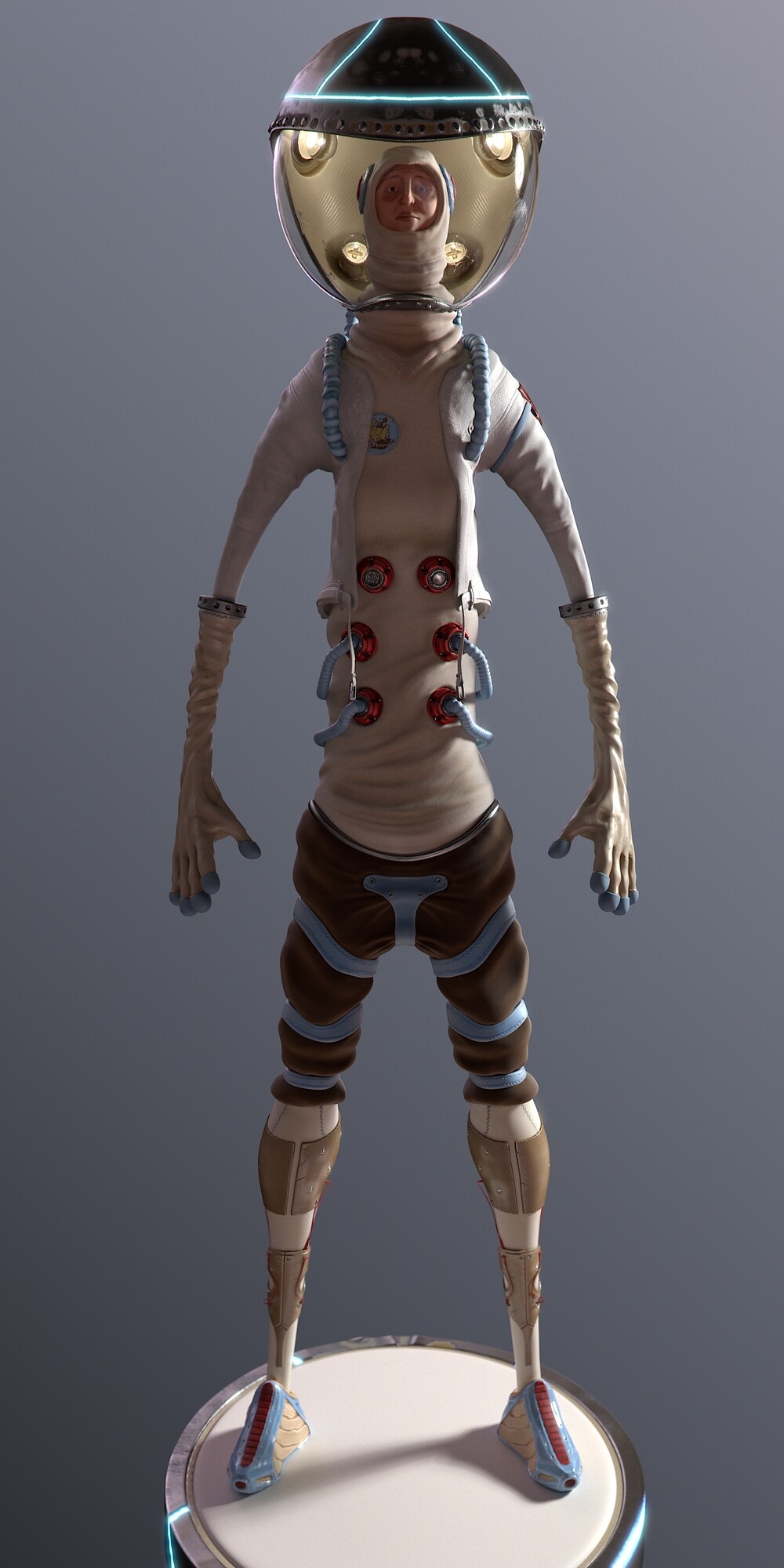
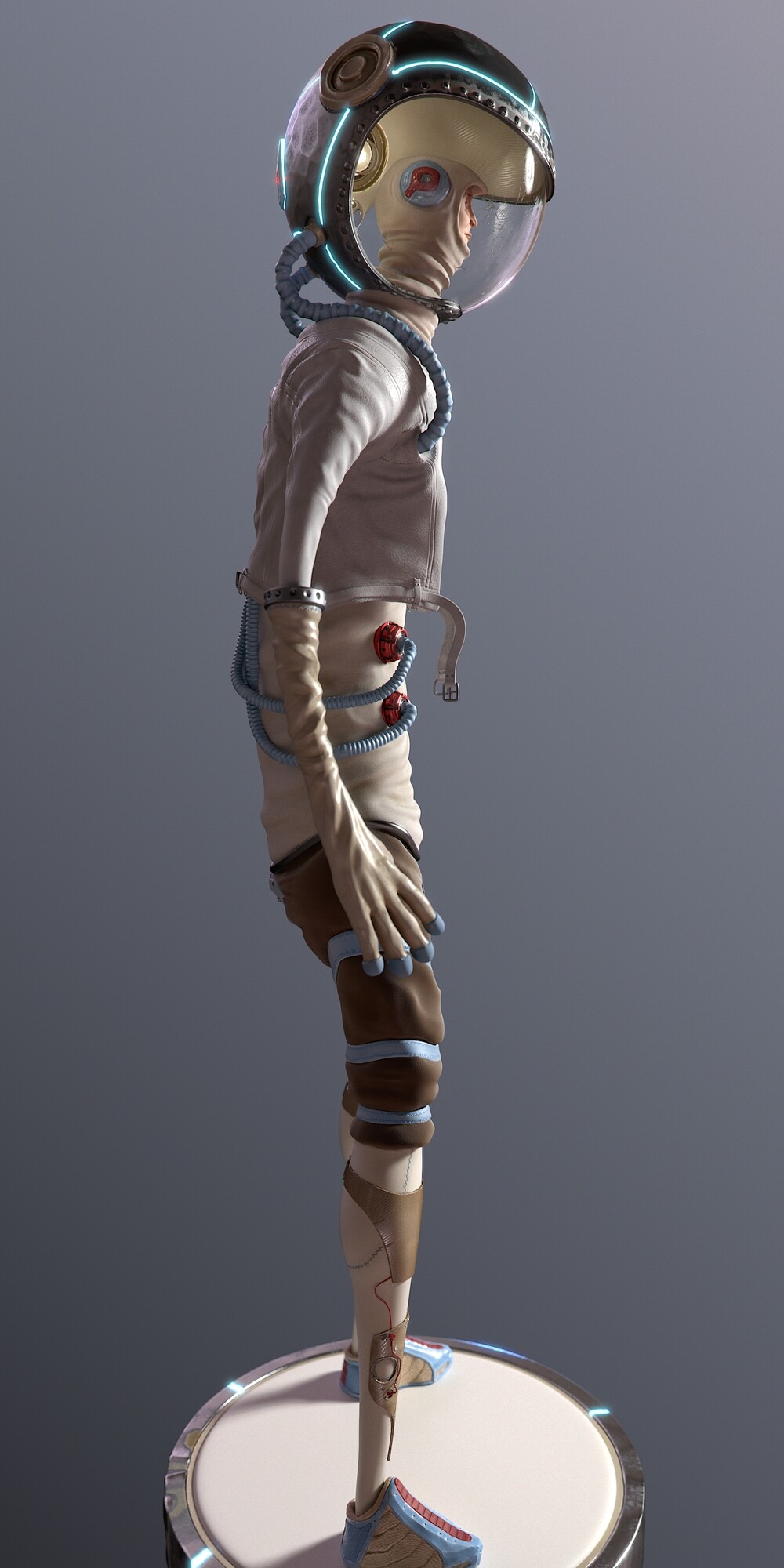
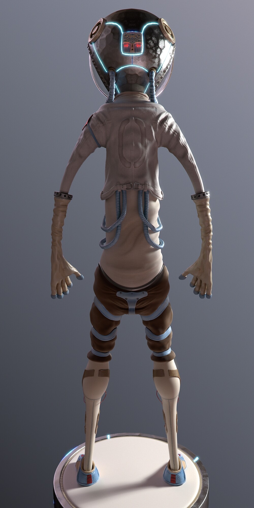
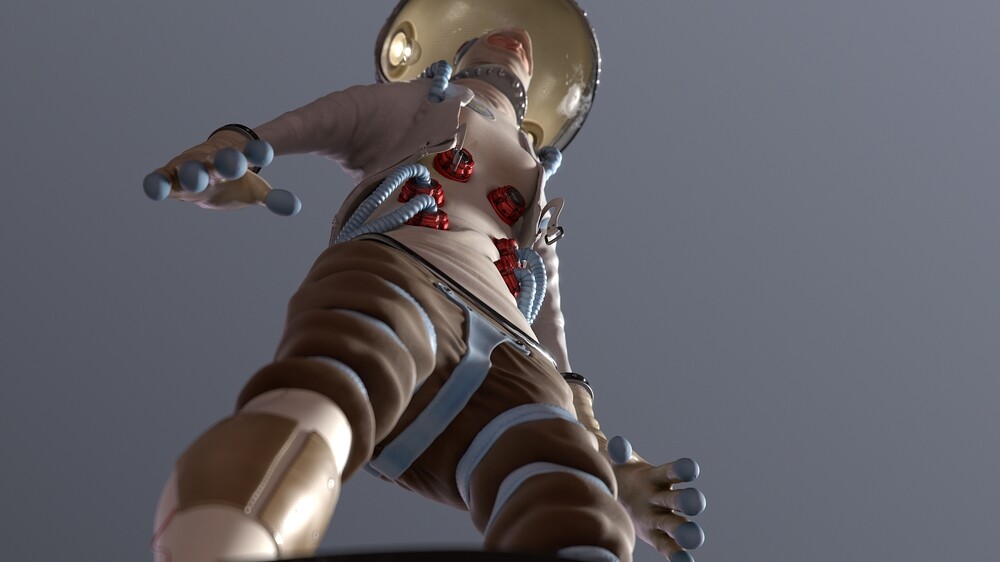
Now, nearly a year after I sent that initial email asking Mr Alfredius' permission to use his design as inspiration, I have something finished. You can see all of that here and it looks a bit like this:

Please do go and look at it, there are lots of renders and a turntable.

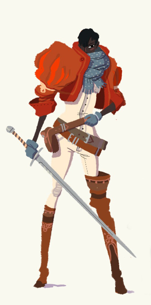
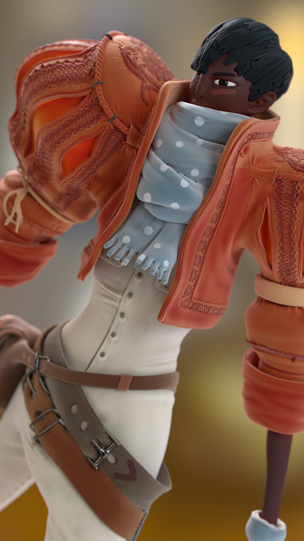
Elliot Alfredius Illustration

But thats not what this post is for, this is for the bit before.

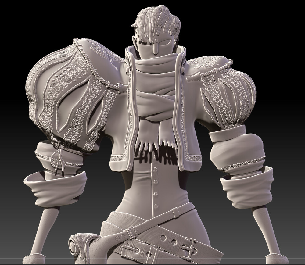
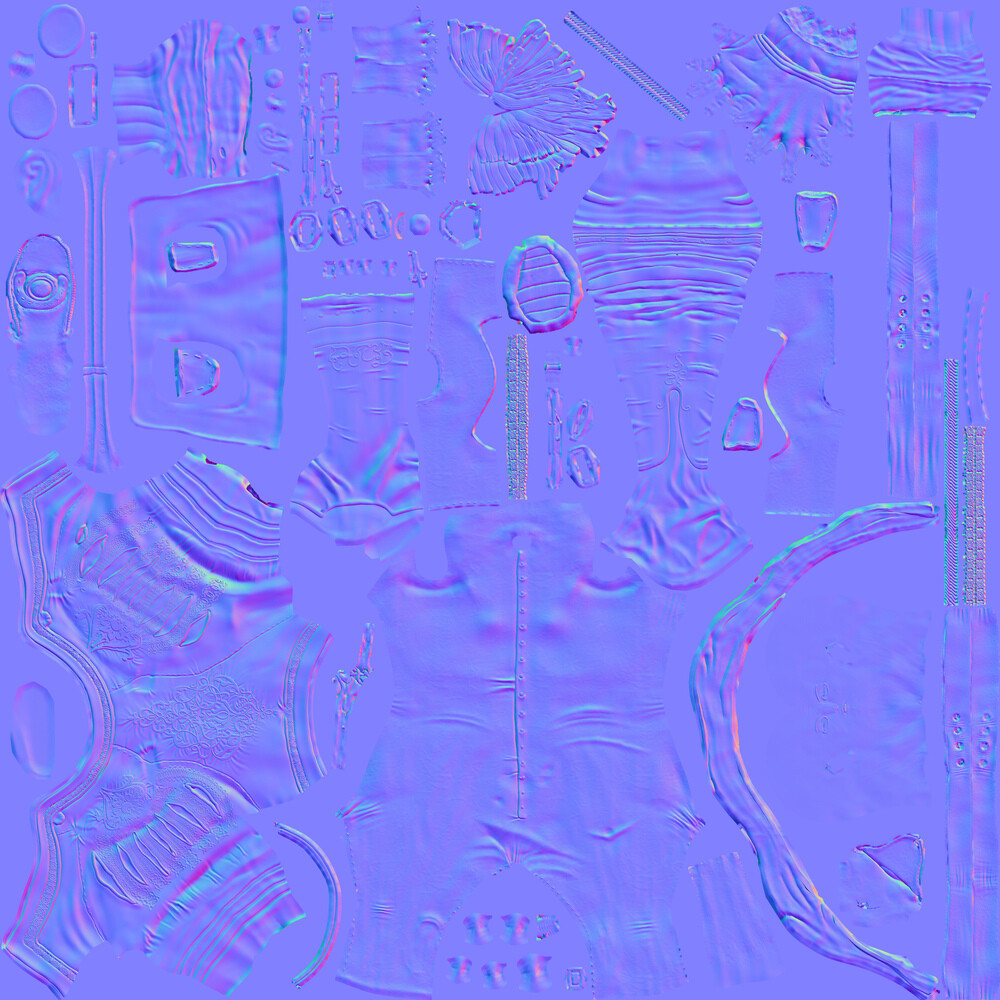
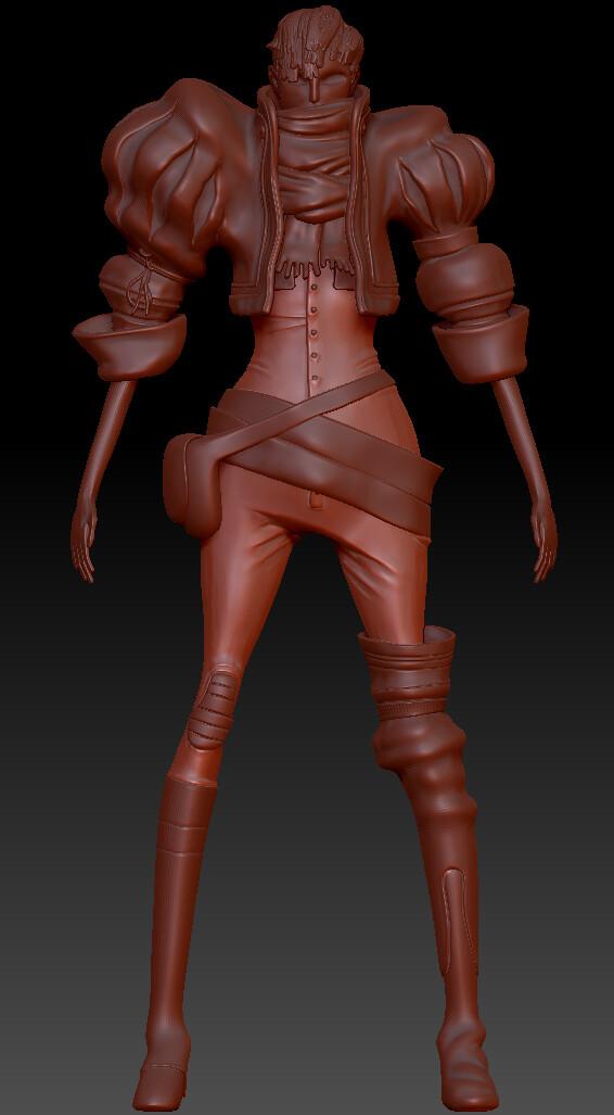
I modelled the base mesh in Maya, I still find this easier than zbrush. I don't know if its quicker, but its certainly less frustrating. zBrush is very quick at radically changing forms, which is great but it also means that very quickly you can end up miles from where you intended to be. Creating or ruining shapes that were close to done minutes ago. So fairly quickly I was able to get to this blobby approximation of the shapes and proportions. The hair and scarf details were slightly more refined than the rest of it at this point.

Early WIP sculpt

I shared work in progress images and took feedback on everything from hand anatomy to costume reference.

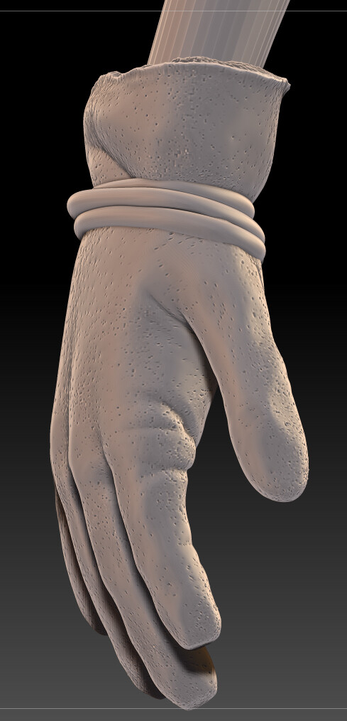
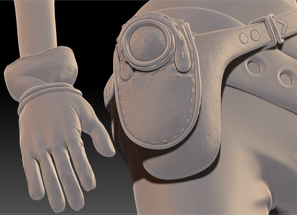
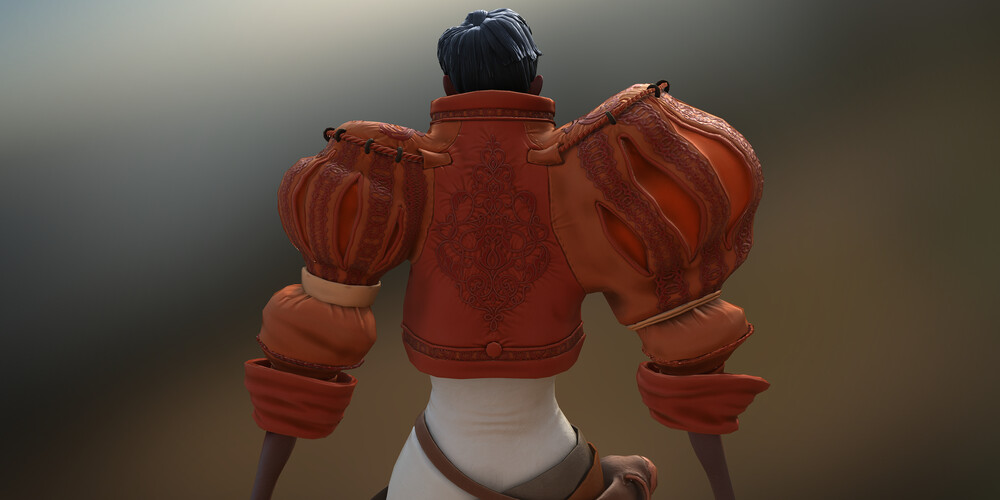
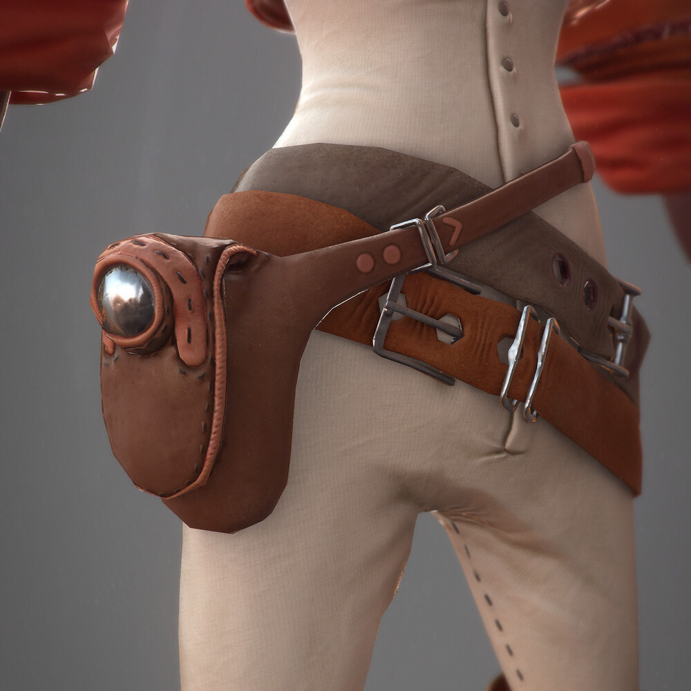
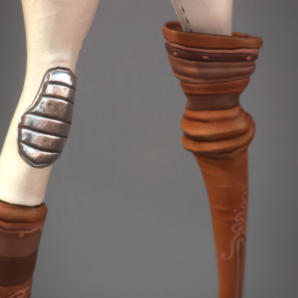
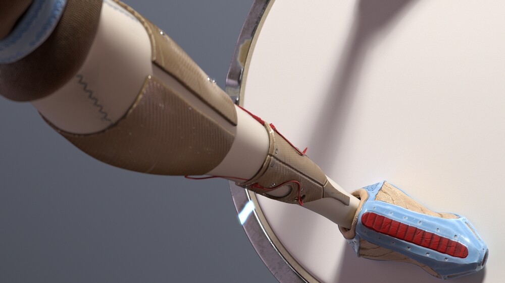
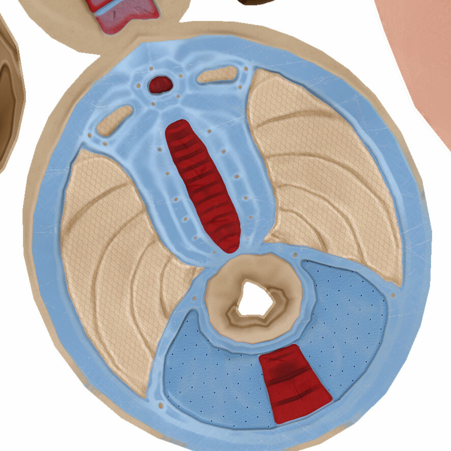
I used a ton of useful tools for these clothing details, which were by far the most fun to create.

  • Panel loops helped me bevel in the slashed sleeved effect after I'd created polygroups where I wanted them.
  • insert mesh brush combined with curve settings helped my lay out lace over the surfaces
  • zproject brush allowed me to fit flat designs onto curved surfaces, like the one below on the jacket back.
  • Created a few custom gradients in Photoshop to use as brush alphas. This tutorial is incredibly helpful.
  • Used the rope brush from Bad King to create nice Sgt. Pepper shoulder nooses.
  • Use the some of the default human ztools to get a head start on heads/hands etc.
  • Frame polygroups with curves to run lengths of thick braided thread down them, nicely lining each sleeve slash.

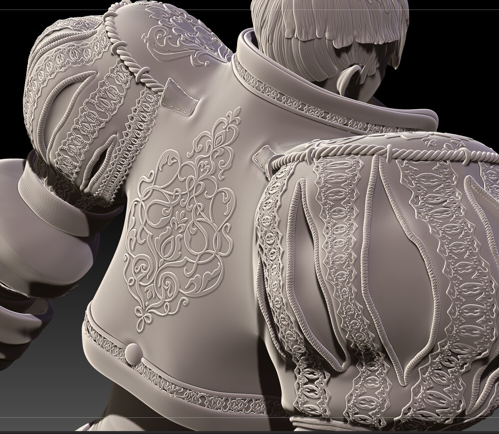
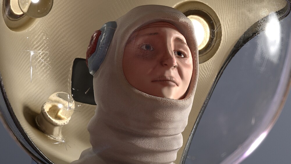
For the hair I looked up a couple of techniques, but settled with the curve snap brush. This tool, when you lower the brush intensity down from 100, gives you a flattened cylinder that you draw out across the scalp. Each strand is its own mesh and has its own polygroup, meaning that when you use the move topological brush, or mask by polygroup you can sculpt and arrange each strand individually. One thing I probably would have done differently is tapered each strand slightly, as the uniform width of each hair strand here gives it the appearance of fabric rather than hair I think.

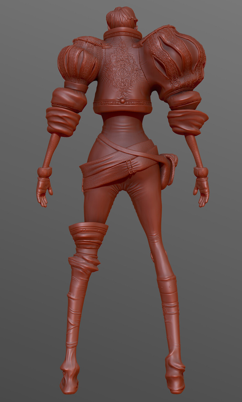
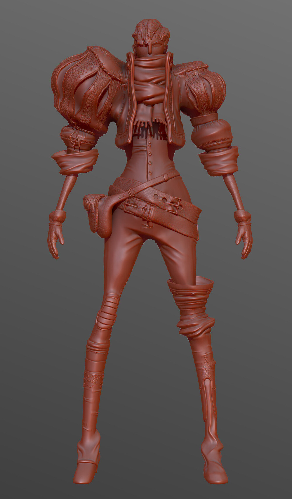
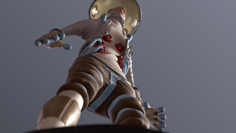
This was the final sculpt before texturing:

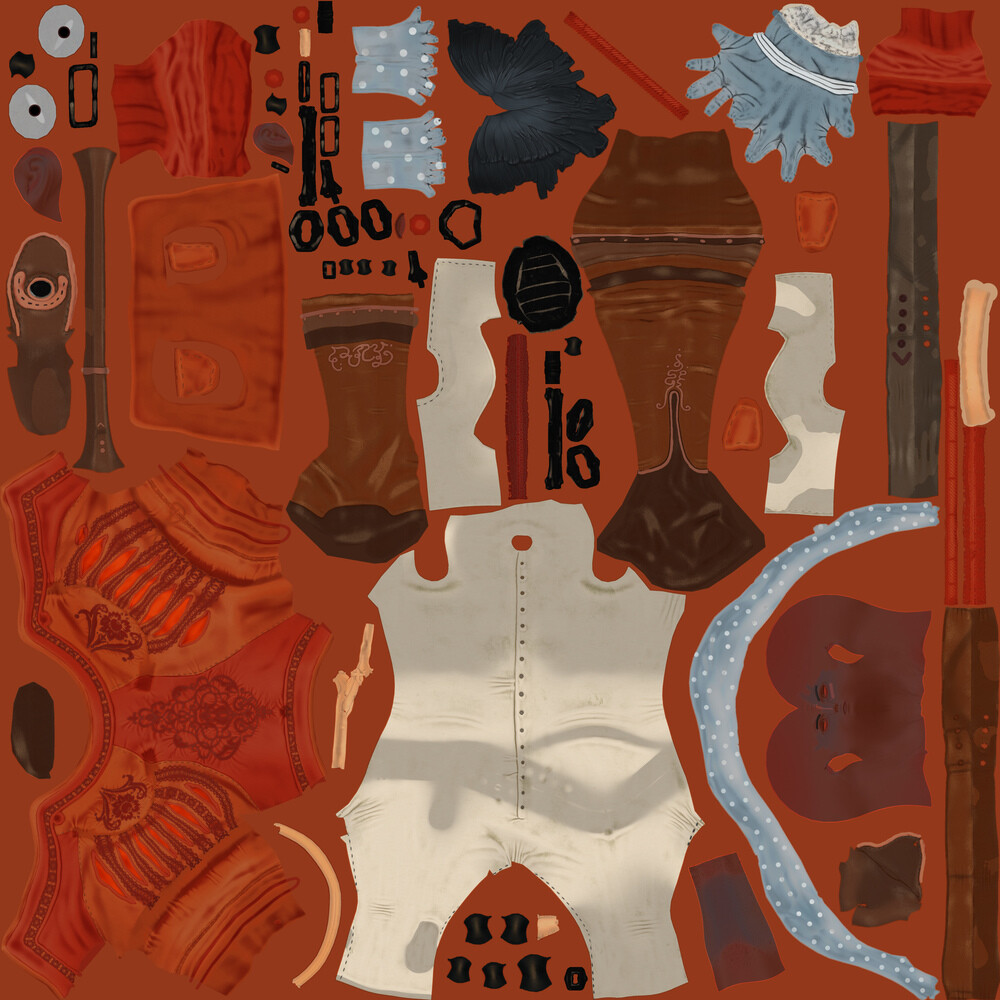
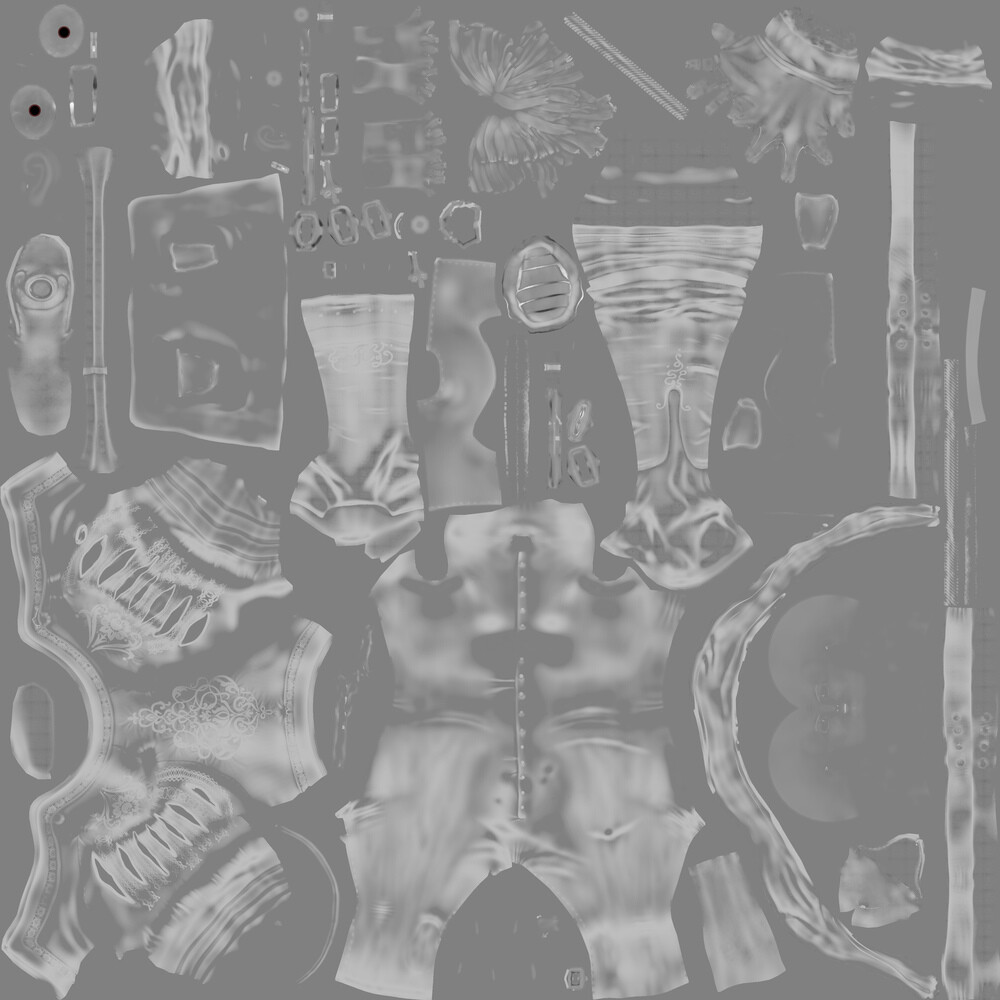
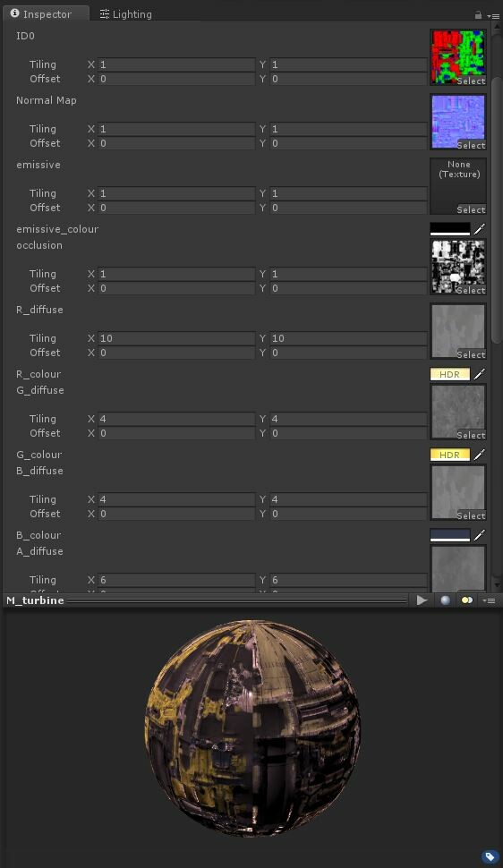
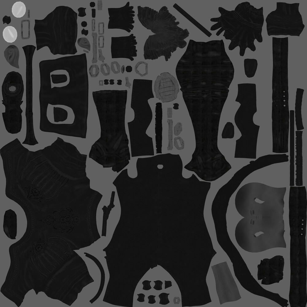
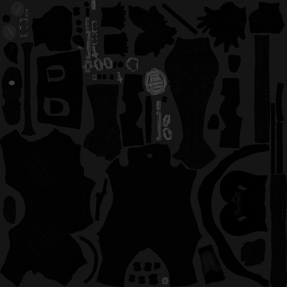
For the texturing process I used the Quixel Suite, specifically dDo.

dDo takes all of the texture maps you export when baking from high poly to low poly, the normal, object normal, ambient occlusion, material IDs. Even more obscure things like gradient maps used for masking. This allows you to create textures using their library of materials and mask them based on details of your sculpt. Say you just want the fabric to gather dirt in the creases, or exhibit wear and tear on the edges, or be sun bleached only on the upward facing areas? All doable, quickly, and non.

I was attempting to bake the maps in a way I wouldn't usually. Normally I would do this all from inside zBrush, but I had separate pieces of geometry I wanted to bake as part of the geometry below it, meaning I need to use turtle in Maya to bake using a raytracing method. This worked better than I expected but still created a number of visible glitches in the displacement map, unfortunately.


The Quixel Suite's real time preview- 3Do, allowed me to view texturing changes from different angles, in varied lighting conditions, and make tweaks with minimal waits between changes. It turned out that specular and gloss attributes required significant adjustment in Vray due to the way fresnel effects a shader's reflectance values. I still have things to learn about the workflow, and the proper compatibility settings for offline renderers needs to be made clearer in the documentation.

Again, please take a look at the final project using the button below.

See SleeveKnight

Pixel Propaganda

General / 27 October 2014

When I was updating my blog regularly I used to include a short section at the end called 'pixel propaganda' where I'd link to a bunch of things I thought were worth sharing. During the height of my dissertation career I was consuming a large amount of video game criticism from the blogosphere, and my favourite writers became regular features in that post blog round up of my weekly word intake.

In the present day I don't read as much games writing as back then, but still more than most people I know. Less theory and design, more culture and journalism. Here are some of my favourite writers currently, people whose opinions and critical ability I respect and enjoy, and people whose style of prose is engaging and/or witty.

Cara Ellison

- Atmospheric embedded journalism with some of the most interesting developers and people in games today. Zeitgeisty, is probably the buzzword you'd put on the poster. Also funny and acutely personal

Leigh Alexander

- Writing that feels crammed with the kind of truths your brain is just on the edge of discovering, but just needed that extra insightful nudge into realisation.

Mattie Brice

-Uncompromising and honest critiques of game tropes, design, and culture. Often approaching things in ways you hadn't considered.

Kirk Hamilton

- Putting the romantic and the poetic into the video game essay. Always exploring new formats and structures with which to understand games.

Matt Lees

- The friendliest of video game voices, there is just something good inside these words.

In light of recent events, one of the above writers pointed out that the best way to show support in the face of all the harassment and abuse would be to critically engage with a person's writing, and respectfully consider their opinions. Rather than merely acknowledging their pain and offering feeble commiserations. I've listed these critics here so you can do just that.

Astr0naught: Rendered Edition

General / 22 September 2014

Astr0naught

Front

Side

Back

Turn Around

Close Ups

Fancy Cam

No intro text, no pre-amble, nothing. But if you do want that pre-amble please see a post breaking down the sculpt process here:

Astr0naught: Making of

The renders where about 6 hours a frame rendered at 4k, I ended having to compromise on the face close up though as vray was really struggling with subsurface skin behind refractive glass at 4k, render times exceeded 24 hours per frame at one point. I did a lot of the base colour texturing in zBrush using the masking tools to pick up creases and details to layer up colour variation and try and bring out the form of things. One of my biggest discoveries on this project was stumbling across a gem of a texture resource called subtlepatterns.com, absolutely tons of  tiling patterns that seem to be intended for web and graphic design, but I found perfect for some of the more synthetic materials I was texturing. I even found great patterns for the leather, mesh, and cloth materials, just enough to layer over a base colour and have a really nice effect.


I call the colour scheme I settled on 'Space Baboon', you only have to look at the show texture above to see why. I also played around with the level of bounce light on the skin, toning it down in order to let more of the scattering to show through. Lots of the hottest highlights were graded, as was the fresnel falloff of the visor to prevent too much reflection from obscuring the face. I made more changes than I expected to in comp, in the end I couldn't get the leather jacket looking how I wanted and changed its colour completely, you can see a work in progress un-composited image below. Finally a healthy dose of depth of field, glint, glow, grain, a subtle sharpen, and chromatic aberration were layered on top.